

A successful luxury showhome design case study is not measured by the number of statement pieces placed within it. It is measured by the confidence with which a prospective buyer can imagine living there: arriving with guests, working quietly, hosting family, resting well and finding a place for the practical details of daily life. The most persuasive showhomes feel composed rather than staged, with every visual decision supported by sound planning.
This case study considers the design principles behind a contemporary four-bedroom new-build residence intended to appeal to discerning purchasers while retaining enough character to feel individual. The brief was not to create a theatrical display. It was to establish a polished, quietly expressive home that gave the architecture clarity and made its potential immediately legible.
The brief: creating aspiration without losing credibility
Showhomes occupy an unusual position in residential design. They must communicate a clear point of view, yet they cannot be so personal that visitors struggle to project their own lives onto the rooms. A scheme that is overly neutral can make a property feel anonymous; one that is too decorative can distract from the asset being sold.
For this residence, the intention was a modern classic interior with a warm, tailored character. The target purchaser was likely to value generous entertaining spaces, a well-resolved principal suite and rooms that could accommodate family life without appearing informal. Rather than treating every room as a separate visual moment, the design established a consistent language of softened geometry, textured natural materials and restrained contrast.
That decision mattered commercially as well as aesthetically. Cohesion allows a buyer to understand a house quickly. From the entrance hall onwards, each space should appear to belong to the same considered whole, even where its function and atmosphere change.
Luxury showhome design case study: beginning with the plan
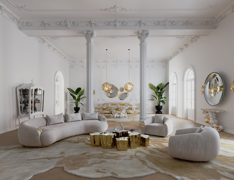
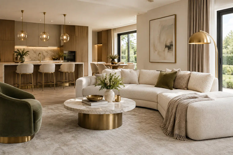
The ground floor had an open kitchen, dining and living arrangement, but its proportions risked reading as one large undifferentiated room. The first task was therefore spatial rather than decorative. Furniture placement was used to create three distinct zones, each with its own purpose and degree of formality.
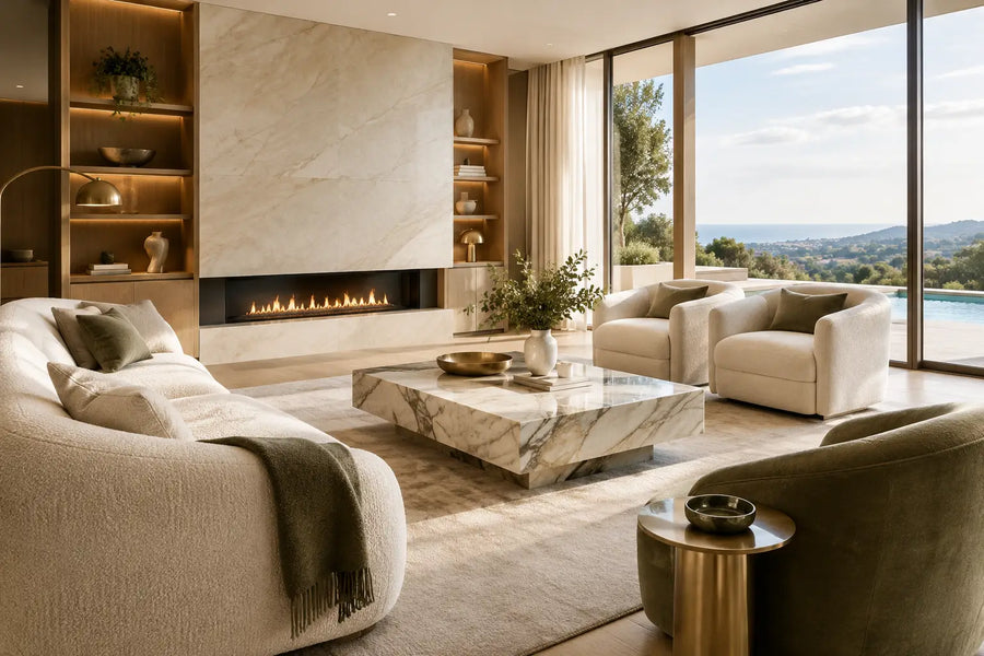
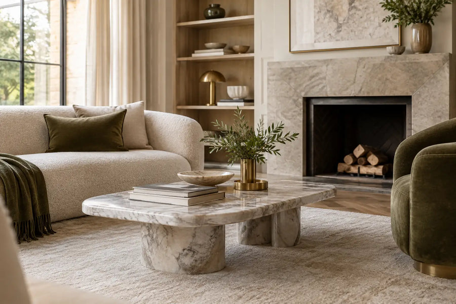
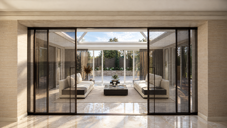
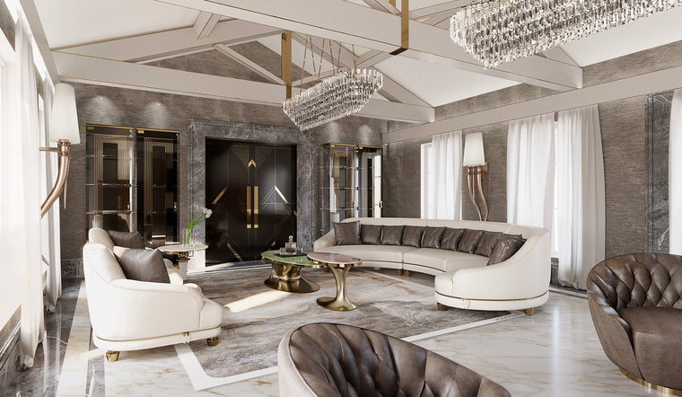
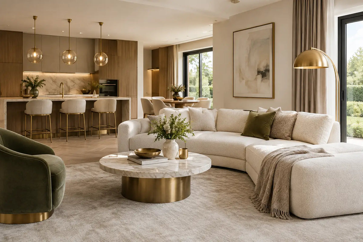
In the living area, a pair of sculptural sofas faced one another across a low, substantial coffee table. This arrangement encouraged conversation and kept sightlines open towards the garden. A generous rug set the seating group within the larger footprint, while two occasional chairs could be moved easily when entertaining. The emphasis was on circulation: visitors could pass through the room without cutting between seating or brushing against corners.
The dining zone was positioned closer to the kitchen but given its own identity through a statement table, upholstered dining chairs and a suspended decorative light. A dining table should never be selected purely for its visual profile. Its scale must allow chairs to be drawn back comfortably, and it must leave a clear route around the setting. In a showhome, these dimensions also demonstrate that the room can support the way people actually entertain.
The kitchen itself required a softer counterpoint to its architectural finishes. Bar stools in tactile upholstery, a carefully considered arrangement of accessories and a pair of lamps at the far end of the island introduced a residential quality. This is a small but telling distinction. Kitchens can appear immaculate and still feel cold if every surface is treated as display cabinetry rather than part of a lived-in home.
A palette built around depth, not decoration
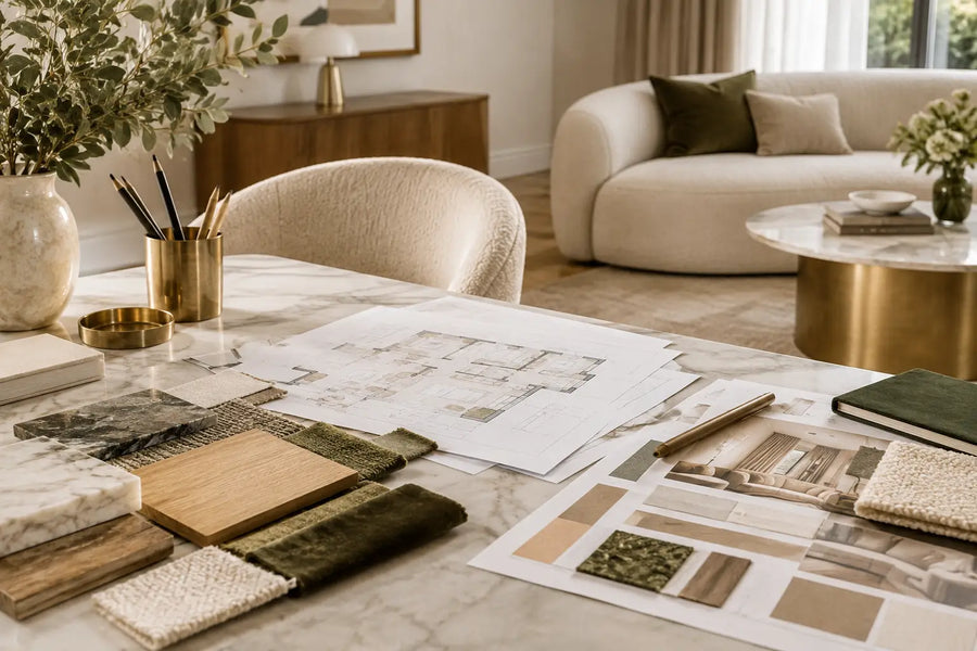
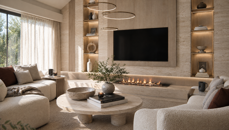
The palette began with warm off-white walls, smoked oak, soft stone and nuanced taupe upholstery. Such a foundation is often misunderstood as safe. In fact, it allows workmanship, silhouette and material to carry the scheme. A pale interior becomes flat only when every finish has the same texture, reflectivity and undertone.
Here, depth came from contrast within a closely related tonal range. Brushed metal details sat against matte plaster finishes; bouclé upholstery was balanced by smooth leather; timber joinery brought grain and shadow to otherwise calm elevations. Deep tobacco, mineral green and oxblood appeared sparingly in cushions, artwork and occasional upholstery. These darker notes gave the rooms definition without forcing a dramatic mood.
Material selection was also guided by maintenance. A showhome may be viewed frequently, but it should still present finishes that make sense for long-term ownership. Delicate pale fabrics can be beautiful in a formal drawing room with limited use. They are less convincing on a family-room sectional or breakfast seating. Performance fabrics, tightly woven wool blends and appropriately sealed stone offer a more realistic expression of quality because they support the life expected of the property.
Lighting that reveals the architecture
Lighting was central to the scheme, particularly because daylight changed considerably across the plan. The front reception room received soft morning light, while the open-plan rear spaces needed considered illumination after dusk. A single decorative fitting would have created pools of brightness and left the rest of the rooms visually unresolved.
Instead, the lighting strategy was layered. Architectural downlights provided discreet general illumination, carefully positioned to avoid harsh shadows on artwork and cabinetry. Decorative pendants established focal points above the dining table and kitchen island. Wall lights in the hall and principal bedroom softened vertical surfaces, while table and floor lamps created the intimate pools of light associated with a finished private residence.
Colour temperature deserves equal attention. Warm white light generally supports the richness of timber, stone and textiles far better than a cool source, which can make even expensive materials appear clinical. Dimming control allowed the mood of each room to shift from daytime viewing to evening entertaining. The result was not simply a better-lit house, but a home with a more convincing sense of atmosphere.
The principal suite: selling calm through proportion
The principal bedroom was designed as a retreat, but not as an over-dressed hotel room. An oversized upholstered bed anchored the space against a wall finished in textured covering, with joinery framing the composition. The bedside tables were deliberately generous, providing usable surface area for books, a lamp and personal items. These functional allowances are easily overlooked in showhomes, where styling can sometimes take precedence over use.
A seating area near the window introduced another layer of possibility. It suggested a private place to read or take a morning coffee without crowding the room. Curtains were installed from close to ceiling level, allowing the window wall to feel taller and more architectural. Their fabric was selected for body and movement, rather than pattern alone, so that the room retained a sense of stillness when the daylight shifted.
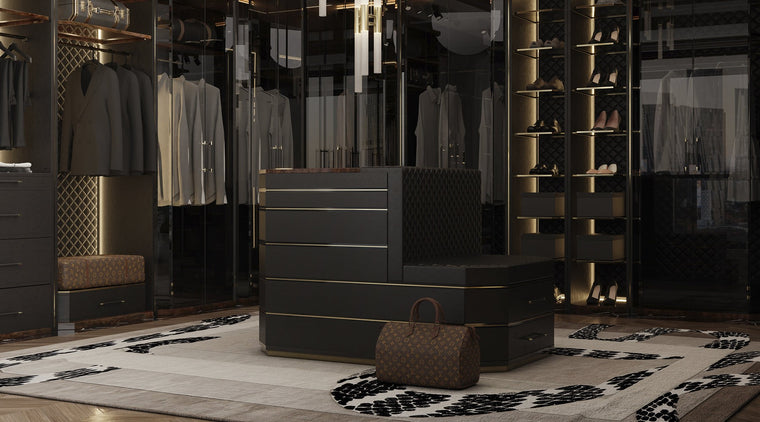
In the dressing area and en suite, the approach was more restrained. Thoughtful internal lighting, elegant hardware and a limited selection of accessories allowed the joinery and sanitaryware to remain the focus. Buyers should notice the quality of these spaces without feeling that they have been dressed beyond recognition.
Secondary rooms with a credible purpose
Bedrooms beyond the principal suite are often where a showhome loses discipline. Treating each one as a themed display can date a scheme quickly and narrow its appeal. In this project, one bedroom was arranged as a refined guest room, one as a child or teenager's room with adaptable furniture, and one as a study-bedroom hybrid.
The hybrid room was especially valuable. It acknowledged that a substantial proportion of buyers now expect a home to accommodate focused work, overnight guests or both. A tailored desk, supportive chair, concealed storage and a proper double bed showed that flexibility need not look temporary. The lesson is simple: demonstrate possibility through scale and planning, not novelty.
What makes a showhome feel enduring
A successful showhome should provide a persuasive first impression, but it should also withstand a second, more analytical viewing. That means avoiding furniture that is undersized for the rooms, decorative schemes that obscure storage limitations, and materials chosen only for photographic impact. Good design does not conceal compromises. It resolves them where possible and presents the property with clarity where it cannot.
For developers, this approach can help a property communicate its value beyond finishes alone. For private homeowners, it offers an equally useful principle: invest first in planning, permanent materials, lighting and the key pieces that define daily use. Accessories and seasonal layers can evolve. The underlying composition should remain assured.
At Touched Interiors, the most considered residential schemes begin with this same discipline: an understanding that exceptional rooms are not assembled from individual purchases, but shaped through proportion, light, material and the rituals of the people who will inhabit them.
Touched Interiors
The Insider is written by the Touched Interiors design studio in Manchester, founded by Kunal Trehan in 2009 and named Interior Design Studio of the Year in 2024 and 2025. About the studio.